VOLUME RATE-OF-CHANGE

0

Category:

Overview

The Volume Rate-of-Change ("ROC") is calculated identically to the Price ROC, except it displays the ROC of the security's volume, rather than of its closing price.


Interpretation

Almost every significant chart formation (e.g., tops, bottoms, breakouts, etc) is accompanied by a sharp increase in volume. The Volume ROC shows the speed at which volume is changing.

Additional information on the interpretation of volume trends can be found in the discussions on Volume and on the Volume Oscillator.


Example

The following chart shows Texas Instruments and its 12-day Volume ROC.


When prices broke out of the triangular pattern, they were accompanied by a sharp increase in volume. The increase in volume confirmed the validity of the price breakout.


Calculation

The Volume Rate-Of-Change indicator is calculated by dividing the amount that volume has changed over the last n-periods by the volume n-periods ago. The result is the percentage that the volume has changed in the last n-periods.

If the volume is higher today than n-periods ago, the ROC will be a positive number. If the volume is lower today than n-periods ago, the ROC will be a negative number.


PRICE RATE-OF-CHANGE

0

Category:

Overview

The Price Rate-of-Change ("ROC") indicator displays the difference between the current price and the price x-time periods ago. The difference can be displayed in either points or as a percentage. The Momentum indicator displays the same information, but expresses it as a ratio.


Interpretation

It is a well recognized phenomenon that security prices surge ahead and retract in a cyclical wave-like motion. This cyclical action is the result of the changing expectations as bulls and bears struggle to control prices.

The ROC displays the wave-like motion in an oscillator format by measuring the amount that prices have changed over a given time period. As prices increase, the ROC rises; as prices fall, the ROC falls. The greater the change in prices, the greater the change in the ROC.

The time period used to calculate the ROC may range from 1-day (which results in a volatile chart showing the daily price change) to 200-days (or longer). The most popular time periods are the 12- and 25-day ROC for short to intermediate-term trading. These time periods were popularized by Gerald Appel and Fred Hitschler in their book, Stock Market Trading Systems.

The 12-day ROC is an excellent short- to intermediate-term overbought/oversold indicator. The higher the ROC, the more overbought the security; the lower the ROC, the more likely a rally. However, as with all overbought/over-sold indicators, it is prudent to wait for the market to begin to correct (i.e., turn up or down) before placing your trade. A market that appears overbought may remain overbought for some time. In fact, extremely overbought/oversold readings usually imply a continuation of the current trend.

The 12-day ROC tends to be very cyclical, oscillating back and forth in a fairly regular cycle. Often, price changes can be anticipated by studying the previous cycles of the ROC and relating the previous cycles to the current market.


Example

The following chart shows the 12-day ROC of Walgreen expressed in percent.

I drew "buy" arrows each time the ROC fell below, and then rose above, the oversold level of -6.5. I drew "sell" arrows each time the ROC rose above, and then fell below, the overbought level of +6.5.

The optimum overbought/oversold levels (e.g., ±6.5) vary depending on the security being analyzed and overall market conditions. I selected ±6.5 by drawing a horizontal line on the chart that isolated previous "extreme" levels of Walgreen's 12-day ROC.


Calculation

When the Rate-of-Change displays the price change in points, it subtracts the price x-time periods ago from today's price:

When the Rate-of-Change displays the price change as a percentage, it divides the price change by price x-time period's ago:


PRICE OSCILLATOR

0

Category:

Overview

The Price Oscillator displays the difference between two moving averages of a security's price. The difference between the moving averages can be expressed in either points or percentages.

The Price Oscillator is almost identical to the MACD, except that the Price Oscillator can use any two user-specified moving averages. (The MACD always uses 12 and 26-day moving averages, and always expresses the difference in points.)


Interpretation

Moving average analysis typically generates buy signals when a short-term moving average (or the security's price) rises above a longer-term moving average. Conversely, sell signals are generated when a shorter-term moving average (or the security's price) falls below a longer-term moving average. The Price Oscillator illustrates the cyclical and often profitable signals generated by these one or two moving average systems.


Example

The following chart shows Kellogg and a 10-day/30-day Price Oscillator.

In this example, the Price Oscillator shows the difference between the moving averages as percentages.

I drew "buy" arrows when the Price Oscillator rose above zero and "sell" arrows when the indicator fell below zero. This example is typical of the Price Oscillator's effectiveness. Because the Price Oscillator is a trend following indicator, it does an outstanding job of keeping you on the right side of the market during trending periods (as shown by the arrows labeled "B," "E," and "F"). However, during less decisive periods, the Price Oscillator produces small losses (as shown by the arrows labeled "A," "C," and "D").


Calculation

The MACD is calculated by subtracting the value of a 26-day exponential moving average from a 12-day exponential moving average. A 9-day dotted exponential moving average of the MACD (the "signal" line) is then plotted on top of the MACD.

When the Price Oscillator displays the difference between the moving averages in percentages, it divides the difference between the averages by the shorter-term moving average:


PERCENT RETRACEMENT (% R)

0

Category:

Overview

A characteristic of a healthy bull market is that it makes higher-highs and higher-lows. This indicates a continual upward shift in expectations and the supply/demand lines. The amount that prices retreat following a higher-high can be measured using a technique referred to as "percent retracement." This measures the percentage that prices "retraced" from the high to the low.

For example, if a stock moves from a low of 50 to a high of 100 and then retraces to 75, the move from 100 to 75 (25 points) retraced 50% of the original move from 50 to 100.


Interpretation

Measuring the percent retracement can be helpful when determining the price levels at which prices will reverse and continue upward. During a vigorous bull market, prices often retrace up to 33% of the original move. It is not uncommon for prices to retrace up to 50%. Retracements of more than 66% almost always signify an end to the bull market.

Some investors feel that the similarities between 33%, 50%, and 66% and the Fibonacci numbersof 38.2%, 50%, and 61.8% are significant. These investors will use Fibonacci Levels to view retracement levels.


Example

I labeled the following chart of Great Western at three points (labeled "A," "B," and "C").


These points define the price before the price move ("A"), at the end of the price move ("B"), and at the retraced price ("C"). In this example, prices have retraced 61.5% of the original price move.

PARABOLIC SAR

0

Category:

Overview

The Parabolic Time/Price System, developed by Welles Wilder, is used to set trailing price stops and is usually referred to as the "SAR" (stop-and-reversal). This indicator is explained thoroughly in Wilder's book, New Concepts in Technical Trading Systems.


Interpretation

The Parabolic SAR provides excellent exit points. You should close long positions when the price falls below the SAR and close short positions when the price rises above the SAR.

If you are long (i.e., the price is above the SAR), the SAR will move up every day, regardless of the direction the price is moving. The amount the SAR moves up depends on the amount that prices move.


Example

The following chart shows Compaq and its Parabolic SAR.


You should be long when the SAR is below prices and short when it is above prices.

The Parabolic SAR is plotted as shown in Wilder's book. Each SAR stop level point is displayed on the day in which it is in effect. Note that the SAR value is today's, not tomorrow's stop level.


Calculation

It is beyond the scope of this book to explain the calculation of the Parabolic SAR. Refer to Wilder's book New Concepts in Technical Trading, for detailed calculation information.

MONEY FLOW INDEX

0

Category:

Overview

The Money Flow Index ("MFI") is a momentum indicator that measures the strength of money flowing in and out of a security. It is related to the Relative Strength Index, but where the RSI only incorporates prices, the Money Flow Index accounts for volume.


Interpretation

The interpretation of the Money Flow Index is as follows:

  • Look for divergence between the indicator and the price action. If the price trends higher and the MFI trends lower (or vice versa), a reversal may be imminent.
  • Look for market tops to occur when the MFI is above 80. Look for market bottoms to occur when the MFI is below 20.

Example

The following chart shows Intel and its 14-day Money Flow Index.

Divergences at points "A" and "B" provided leading indications of the reversals that followed.


Calculation

The Money Flow Index requires a series of calculations. First, the period's Typical Price is calculated.


Next, Money Flow (not the Money Flow Index) is calculated by multiplying the period's Typical Price by the volume.


If today's Typical Price is greater than yesterday's Typical Price, it is considered Positive Money Flow. If today's price is less, it is considered Negative Money Flow.

Positive Money Flow is the sum of the Positive Money over the specified number of periods. Negative Money Flow is the sum of the Negative Money over the specified number of periods.

The Money Ratio is then calculated by dividing the Positive Money Flow by the Negative Money Flow.


Finally, the Money Flow Index is calculated using the Money Ratio.


MOMENTUM

0

Category:

Overview

The Momentum indicator measures the amount that a security's price has changed over a given time span.


Interpretation

The interpretation of the Momentum indicator is identical to the interpretation of the Price ROC. Both indicators display the rate-of-change of a security's price. However, the Price ROC indicator displays the rate-of-change as a percentage whereas the Momentum indicator displays the rate-of-change as a ratio.

There are basically two ways to use the Momentum indicator:

  • You can use the Momentum indicator as a trend-following oscillator similar to the MACD (this is the method I prefer). Buy when the indicator bottoms and turns up and sell when the indicator peaks and turns down. You may want to plot a short-term (e.g., 9-period) moving average of the indicator to determine when it is bottoming or peaking.

    If the Momentum indicator reaches extremely high or low values (relative to its historical values), you should assume a continuation of the current trend. For example, if the Momentum indicator reaches extremely high values and then turns down, you should assume prices will probably go still higher. In either case, only trade after prices confirm the signal generated by the indicator (e.g., if prices peak and turn down, wait for prices to begin to fall before selling).

  • You can also use the Momentum indicator as a leading indicator. This method assumes that market tops are typically identified by a rapid price increase (when everyone expects prices to go higher) and that market bottoms typically end with rapid price declines (when everyone wants to get out). This is often the case, but it is also a broad generalization.

    As a market peaks, the Momentum indicator will climb sharply and then fall off-- diverging from the continued upward or sideways movement of the price. Similarly, at a market bottom, Momentum will drop sharply and then begin to climb well ahead of prices. Both of these situations result in divergences between the indicator and prices.


Example

The following chart shows Integrated Circuits and its 12-day Momentum indicator.

Divergences at points "A" and "B" provided leading indications of the reversals that followed.

MACD

1

Category:

Overview

The MACD ("Moving Average Convergence/Divergence") is a trend following momentum indicator that shows the relationship between two moving averages of prices. The MACD was developed by Gerald Appel, publisher of Systems and Forecasts.

The MACD is the difference between a 26-day and 12-day exponential moving average. A 9-day exponential moving average, called the "signal" (or "trigger") line is plotted on top of the MACD to show buy/sell opportunities. (Appel specifies exponential moving averages as percentages. Thus, he refers to these three moving averages as 7.5%, 15%, and 20% respectively.)


Interpretation

The MACD proves most effective in wide-swinging trading markets. There are three popular ways to use the MACD: crossovers, overbought/oversold conditions, and divergences.

Crossovers

The basic MACD trading rule is to sell when the MACD falls below its signal line. Similarly, a buy signal occurs when the MACD rises above its signal line. It is also popular to buy/sell when the MACD goes above/below zero.

Overbought/Oversold Conditions

The MACD is also useful as an overbought/oversold indicator. When the shorter moving average pulls away dramatically from the longer moving average (i.e., the MACD rises), it is likely that the security price is overextending and will soon return to more realistic levels. MACD overbought and oversold conditions exist vary from security to security.

Divergences

An indication that an end to the current trend may be near occurs when the MACD diverges from the security. A bearish divergence occurs when the MACD is making new lows while prices fail to reach new lows. A bullish divergence occurs when the MACD is making new highs while prices fail to reach new highs. Both of these divergences are most significant when they occur at relatively overbought/oversold levels.


Example

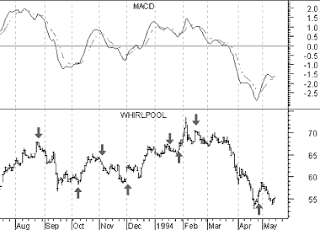
The following chart shows Whirlpool and its MACD.

I drew "buy" arrows when the MACD rose above its signal line and drew "sell" when the MACD fell below its signal line.

This chart shows that the MACD is truly a trend following indicator--sacrificing early signals in exchange for keeping you on the right side of the market. When a significant trend developed, such as in October 1993 and beginning in February 1994, the MACD was able to capture the majority of the move. When the trend was short lived, such as in January 1993, the MACD proved unprofitable.


Calculation

The MACD is calculated by subtracting the value of a 26-day exponential moving average from a 12-day exponential moving average. A 9-day dotted exponential moving average of the MACD (the "signal" line) is then plotted on top of the MACD.

LINEAR REGRESSION LINES

1

Category:

Overview

Linear regression is a statistical tool used to predict future values from past values. In the case of security prices, it is commonly used to determine when prices are overextended.

A Linear Regression trendline uses the least squares method to plot a straight line through prices so as to minimize the distances between the prices and the resulting trendline.


Interpretation

If you had to guess what a particular security's price would be tomorrow, a logical guess would be "fairly close to today's price." If prices are trending up, a better guess might be "fairly close to today's price with an upward bias." Linear regression analysis is the statistical confirmation of these logical assumptions.

A Linear Regression trendline is simply a trendline drawn between two points using the least squares fit method. The trendline is displayed in the exact middle of the prices. If you think of this trendline as the "equilibrium" price, any move above or below the trendline indicates overzealous buyers or sellers.

A popular method of using the Linear Regression trendline is to construct Linear Regression Channel lines. Developed by Gilbert Raff, the channel is constructed by plotting two parallel, equidistant lines above and below a Linear Regression trendline. The distance between the channel lines to the regression line is the greatest distance that any one closing price is from the regression line. Regression Channels contain price movement, with the bottom channel line providing support and the top channel line providing resistance. Prices may extend outside of the channel for a short period of time. However if prices remain outside the channel for a longer period of time, a reversal in trend may be imminent.

A Linear Regression trendline shows where equilibrium exists. Linear Regression Channels show the range prices can be expected to deviate from a Linear Regression trendline.

The Time Series Forecast indicator displays the same information as a Linear Regression trendline. Any point along the Time Series Forecast is equal to the ending value of a Linear Regression Trendline. For example, the ending value of a Linear Regression trendline that covers 10 days will have the same value as a 10-day Time Series Forecast.


Example

The following chart shows the Japanese Yen with a Linear Regression Channel.

Calculation

The linear regression formula is:

Where:


STOCHASTIC OSCILLATOR

0

Category:

Overview

Sto.chas.tic (sto kas'tik) adj. 2. Math. designating a process having an infinite progression of jointly distributed random variables.
--- Webster's New World Dictionary

The Stochastic Oscillator compares where a security's price closed relative to its price range over a given time period.


Interpretation

The Stochastic Oscillator is displayed as two lines. The main line is called "%K." The second line, called "%D," is a moving average of %K. The %K line is usually displayed as a solid line and the %D line is usually displayed as a dotted line.

There are several ways to interpret a Stochastic Oscillator. Three popular methods include:

  1. Buy when the Oscillator (either %K or %D) falls below a specific level (e.g., 20) and then rises above that level. Sell when the Oscillator rises above a specific level (e.g., 80) and then falls below that level.
  2. Buy when the %K line rises above the %D line and sell when the %K line falls below the %D line.
  3. Look for divergences. For example, where prices are making a series of new highs and the Stochastic Oscillator is failing to surpass its previous highs.

Example

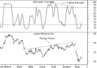
The following chart shows Avon Products and its 10-day Stochastic.


I drew "buy" arrows when the %K line fell below, and then rose above, the level of 20. Similarly, I drew "sell" arrows when the %K line rose above, and then fell below, the level of 80.

This next chart also shows Avon Products.


In this example I drew "buy" arrows each time the %K line rose above the %D (dotted). Similarly, "sell" arrows were drawn when the %K line fell below the %D line.

This final chart shows a divergence between the Stochastic Oscillator and prices.

This is a classic divergence where prices are headed higher, but the underlying indicator (the Stochastic Oscillator) is moving lower. When a divergence occurs between an indicator and prices, the indicator typically provides the clue as to where prices will head.


Calculation

The Stochastic Oscillator has four variables:

  1. %K Periods. This is the number of time periods used in the stochastic calculation.
  2. %K Slowing Periods. This value controls the internal smoothing of %K. A value of 1 is considered a fast stochastic; a value of 3 is considered a slow stochastic.
  3. %D Periods.This is the number of time periods used when calculating a moving average of %K. The moving average is called "%D" and is usually displayed as a dotted line on top of %K.
  4. %D Method.The method (i.e., Exponential, Simple, Time Series, Triangular, Variable, or Weighted) that is used to calculate %D.

The formula for %K is:


For example, to calculate a 10-day %K, first find the security's highest-high and lowest-low over the last 10 days. As an example, let's assume that during the last 10 days the highest-high was 46 and the lowest-low was 38--a range of 8 points. If today's closing price was 41, %K would be calculated as:

The 37.5% in this example shows that today's close was at the level of 37.5% relative to the security's trading range over the last 10 days. If today's close was 42, the Stochastic Oscillator would be 50%. This would mean that that the security closed today at 50%, or the mid-point, of its 10-day trading range.

The above example used a %K Slowing Period of 1-day (no slowing). If you use a value greater than one, you average the highest-high and the lowest-low over the number of %K Slowing Periods before performing the division.

A moving average of %K is then calculated using the number of time periods specified in the %D Periods. This moving average is called %D.

The Stochastic Oscillator always ranges between 0% and 100%. A reading of 0% shows that the security's close was the lowest price that the security has traded during the preceding x-time periods. A reading of 100% shows that the security's close was the highest price that the security has traded during the preceding x-time periods.

Weighted Moving Average

0

Category:

A weighted moving average is designed to put more weight on recent data and less weight on past data. A weighted moving average is calculated by multiplying each of the previous day's data by a weight. The following table shows the calculation of a 5-day weighted moving average.

Table
5-day Weighted moving average
Day # Weight
Price Weighted


Average
1 1 * 25.00 = 25.00


2 2 * 26.00 = 52.00


3 3 * 28.00 = 84.00


4 4 * 25.00 = 100.00


5 5 * 29.00 = 145.00


Totals: 15 * 133.00 = 406.00 / 15 = 27.067

The weight is based on the number of days in the moving average. In the above example, the weight on the first day is 1.0 while the value on the most recent day is 5.0. This gives five times more weight to today's price than the price five days ago.

The following chart displays 25-day moving averages using the simple, exponential, weighted, triangular, and variable methods of calculation.


Variable Moving Average

1

Category:

A variable moving average is an exponential moving average that automatically adjusts the smoothing percentage based on the volatility of the data series. The more volatile the data, the more sensitive the smoothing constant used in the moving average calculation. Sensitivity is increased by giving more weight given to the current data.

Most moving average calculation methods are unable to compensate for trading range versus trending markets. During trading ranges (when prices move sideways in a narrow range) shorter term moving averages tend to produce numerous false signals. In trending markets (when prices move up or down over an extended period) longer term moving averages are slow to react to reversals in trend. By automatically adjusting the smoothing constant, a variable moving average is able to adjust its sensitivity, allowing it to perform better in both types of markets.

A variable moving average is calculated as follows:


Where:

Triangular Moving Average

0

Category:

Triangular

Triangular moving averages place the majority of the weight on the middle portion of the price series. They are actually double-smoothed simple moving averages. The periods used in the simple moving averages varies depending on if you specify an odd or even number of time periods.

The following steps explain how to calculate a 12-period triangular moving average.

  1. Add 1 to the number of periods in the moving average (e.g., 12 plus 1 is 13).
  2. Divide the sum from Step #1 by 2 (e.g., 13 divided by 2 is 6.5).
  3. If the result of Step #2 contains a fractional portion, round the result up to the nearest integer (e.g., round 6.5 up to 7).
  4. Using the value from Step #3 (i.e., 7), calculate a simple moving average of the closing prices (i.e., a 7-period simple moving average).
  5. Again using the value from Step #3 (i.e., 7) calculate a simple moving average of the moving average calculated in Step #4 (i.e., a moving average of a moving average).

Simple Moving Average

0

Category:

A simple, or arithmetic, moving average is calculated by adding the closing price of the security for a number of time periods (e.g., 12 days) and then dividing this total by the number of time periods. The result is the average price of the security over the time period. Simple moving averages give equal weight to each daily price.

For example, to calculate a 21-day moving average of IBM: First, you would add IBM's closing prices for the most recent 21 days. Next, you would divide that sum by 21; this would give you the average price of IBM over the preceding 21 days. You would plot this average price on the chart. You would perform the same calculation tomorrow: add up the previous 21 days' closing prices, divide by 21, and plot the resulting figure on the chart.


where


MOVING AVERAGES

1

Category:

Overview

A Moving Average is an indicator that shows the average value of a security's price over a period of time. When calculating a moving average, a mathematical analysis of the security's average value over a predetermined time period is made. As the security's price changes, its average price moves up or down.

There are five popular types of moving averages: simple (also referred to as arithmetic), exponential, triangular, variable, and weighted. Moving averages can be calculated on any data series including a security's open, high, low, close, volume, or another indicator. A moving average of another moving average is also common.

The only significant difference between the various types of moving averages is the weight assigned to the most recent data. Simple moving averages apply equal weight to the prices. Exponential and weighted averages apply more weight to recent prices. Triangular averages apply more weight to prices in the middle of the time period. And variable moving averages change the weighting based on the volatility of prices.


Interpretation

The most popular method of interpreting a moving average is to compare the relationship between a moving average of the security's price with the security's price itself. A buy signal is generated when the security's price rises above its moving average and a sell signal is generated when the security's price falls below its moving average.

The following chart shows the Dow Jones Industrial Average ("DJIA") from 1970 through 1993.


Also displayed is a 15-month simple moving average. "Buy" arrows were drawn when the DJIA's close rose above its moving average; "sell" arrows were drawn when it closed below its moving average.

This type of moving average trading system is not intended to get you in at the exact bottom nor out at the exact top. Rather, it is designed to keep you in line with the security's price trend by buying shortly after the security's price bottoms and selling shortly after it tops.

The critical element in a moving average is the number of time periods used in calculating the average. When using hindsight, you can always find a moving average that would have been profitable (using a computer, I found that the optimum number of months in the preceding chart would have been 43). The key is to find a moving average that will be consistently profitable. The most popular moving average is the 39-week (or 200-day) moving average. This moving average has an excellent track record in timing the major (long-term) market cycles.

The length of a moving average should fit the market cycle you wish to follow. For example if you determine that a security has a 40-day peak to peak cycle, the ideal moving average length would be 21 days calculated using the following formula:


Trend Moving Average
Very Short Term 5-13 days
Short Term 14-25 days
Minor Intermediate 26-49 days
Intermediate 50-100 days
Long Term 100-200 days

You can convert a daily moving average quantity into a weekly moving average quantity by dividing the number of days by 5 (e.g., a 200-day moving average is almost identical to a 40-week moving average). To convert a daily moving average quantity into a monthly quantity, divide the number of days by 21 (e.g., a 200-day moving average is very similar to a 9-month moving average, because there are approximately 21 trading days in a month).

Moving averages can also be calculated and plotted on indicators. The interpretation of an indicator's moving average is similar to the interpretation of a security's moving average: when the indicator rises above its moving average, it signifies a continued upward movement by the indicator; when the indicator falls below its moving average, it signifies a continued downward movement by the indicator.

Indicators which are especially well-suited for use with moving average penetration systems include the MACD, Price ROC, Momentum, and Stochastics.

Some indicators, such as short-term Stochastics, fluctuate so erratically that it is difficult to tell what their trend really is. By erasing the indicator and then plotting a moving average of the indica-tor, you can see the general trend of the indicator rather than its day-to-day fluctuations.

Whipsaws can be reduced, at the expense of slightly later signals, by plotting a short-term moving average (e.g., 2-10 day) of oscillating indicators such as the 12-day ROC, Stochas-tics, or the RSI. For example, rather than selling when the Stochastic Oscillator falls below 80, you might sell only when a 5-period moving average of the Stochastic Oscillator falls below 80.

Exponential Moving Average

0

Category:

Exponential

An exponential (or exponentially weighted) moving average is calculated by applying a percentage of today's closing price to yesterday's moving average value. Exponential moving averages place more weight on recent prices.

For example, to calculate a 9% exponential moving average of IBM, you would first take today's closing price and multiply it by 9%. Next, you would add this product to the value of yesterday's moving average multiplied by 91% (100% - 9% = 91%).


Because most investors feel more comfortable working with time periods, rather than with percentages, the exponential percentage can be converted into an approximate number of days. For example, a 9% moving average is equal to a 21.2 time period (rounded to 21) exponential moving average.

The formula for converting exponential percentages to time periods is:


You can use the above formula to determine that a 9% moving average is equivalent to a 21-day exponential moving average:

The formula for converting time periods to exponential percentages is:


You can use the above formula to determine that a 21-day exponential moving average is actually a 9% moving average:


ENVELOPES (TRADING BANDS)

0

Category:

Overview

An envelope is comprised of two moving averages. One moving average is shifted upward and the second moving average is shifted downward.


Interpretation

Envelopes define the upper and lower boundaries of a security's normal trading range. A sell signal is generated when the security reaches the upper band whereas a buy signal is generated at the lower band. The optimum percentage shift depends on the volatility of the security--the more volatile, the larger the percentage.

The logic behind envelopes is that overzealous buyers and sellers push the price to the extremes (i.e., the upper and lower bands), at which point the prices often stabilize by moving to more realistic levels. This is similar to the interpretation of Bollinger Bands.


Example

The following chart displays American Brands with a 6% envelope of a 25-day exponential moving average.


You can see how American Brands' price tended to bounce off the bands rather than penetrate them.


Calculation

Envelopes are calculated by shifted moving averages. In the above example, one 25-day exponential moving average was shifted up 6% and another 25-day moving average was shifted down 6%.

CCI - COMMODITY CHANNEL INDEX

1

Category:

Overview

The Commodity Channel Index ("CCI") measures the variation of a security's price from its statistical mean. High values show that prices are unusually high compared to average prices whereas low values indicate that prices are unusually low. Contrary to its name, the CCI can be used effectively on any type of security, not just commodities.

The CCI was developed by Donald Lambert.


Interpretation

There are two basic methods of interpreting the CCI: looking for divergences and as an overbought/oversold indicator.

  • A divergence occurs when the security's prices are making new highs while the CCI is failing to surpass its previous highs. This classic divergence is usually followed by a correction in the security's price.

  • The CCI typically oscillates between ±100. To use the CCI as an overbought/oversold indicator, readings above +100 imply an overbought condition (and a pending price correction) while readings below -100 imply an oversold condition (and a pending rally).

Example

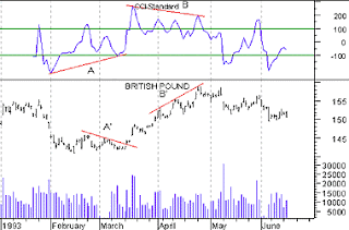
The following chart shows the British Pound and its 14-day CCI. A bullish divergence occurred at point "A" (prices were declining as the CCI was advancing). Prices subsequently rallied. A bearish divergence occurred at point "B" (prices were advancing while the CCI was declining). Prices corrected. Note too, that each of these divergences occurred at extreme levels (i.e., above +100 or below -100) making them even more significant.


Calculation

A complete explanation of the CCI calculation is beyond the scope of this book. The following are basic steps involved in the calculation:

  1. Add each period's high, low, and close and divide this sum by 3. This is the typical price.

  2. Calculate an n-period simple moving average of the typical prices computed in Step 1.

  3. For each of the prior n-periods, subtract today's Step 2 value from Step 1's value n days ago. For example, if you were calculating a 5-day CCI, you would perform five subtractions using today's Step 2 value.

  4. Calculate an n-period simple moving average of the absolute values of each of the results in Step 3.

  5. Multiply the value in Step 4 by 0.015.

  6. Subtract the value from Step 2 from the value in Step 1.

  7. Divide the value in Step 6 by the value in Step 5.

Further details on the contents and interpretation of the CCI can be found in an article by Donald Lambert that appeared in the October 1980 issue of Commodities (now known as Futures) Magazine.

BOLLINGER BANDS

0

Category:

Overview

Bollinger Bands are similar to moving average envelopes. The difference between Bollinger Bands and envelopes is envelopes are plotted at a fixed percentage above and below a moving average, whereas Bollinger Bands are plotted at standard deviation levels above and below a moving average. Since standard deviation is a measure of volatility, the bands are self-adjusting: widening during volatile markets and contracting during calmer periods.

Bollinger Bands were created by John Bollinger.


Interpretation

Bollinger Bands are usually displayed on top of security prices, but they can be displayed on an indicator. These comments refer to bands displayed on prices.

As with moving average envelopes, the basic interpretation of Bollinger Bands is that prices tend to stay within the upper- and lower-band. The distinctive characteristic of Bollinger Bands is that the spacing between the bands varies based on the volatility of the prices. During periods of extreme price changes (i.e., high volatility), the bands widen to become more forgiving. During periods of stagnant pricing (i.e., low volatility), the bands narrow to contain prices.

Mr. Bollinger notes the following characteristics of Bollinger Bands.

  • Sharp price changes tend to occur after the bands tighten, as volatility lessens.
  • When prices move outside the bands, a continuation of the current trend is implied.
  • Bottoms and tops made outside the bands followed by bottoms and tops made inside the bands call for reversals in the trend.
  • A move that originates at one band tends to go all the way to the other band. This observation is useful when projecting price targets.

Example

The following chart shows Bollinger Bands on Exxon's prices.


The Bands were calculated using a 20-day exponential moving average and are spaced two deviations apart.

The bands were at their widest when prices were volatile during April. They narrowed when prices entered a consolidation period later in the year. The narrowing of the bands increases the probability of a sharp breakout in prices. The longer prices remain within the narrow bands the more likely a price breakout.


Calculation

Bollinger Bands are displayed as three bands. The middle band is a normal moving average. In the following formula, "n" is the number of time periods in the moving average (e.g., 20 days).


The upper band is the same as the middle band, but it is shifted up by the number of standard deviations (e.g., two deviations). In this next formula, "D" is the number of standard deviations.


The lower band is the moving average shifted down by the same number of standard deviations (i.e., "D").


Mr. Bollinger recommends using "20" for the number of periods in the moving average, calculating the moving average using the "simple" method (as shown in the formula for the middle band), and using 2 standard deviations. He has also found that moving averages of less then 10 periods do not work very well.

AVERAGE TRUE RANGE

0

Category:

Overview

The Average True Range ("ATR") is a measure of volatility. It was introduced by Welles Wilder in his book, New Concepts in Technical Trading Systems, and has since been used as a component of many indicators and trading systems.


Interpretation

Wilder has found that high ATR values often occur at market bottoms following a "panic" sell-off. Low Average True Range values are often found during extended sideways periods, such as those found at tops and after consolidation periods.

The Average True Range can be interpreted using the same techniques that are used with the other volatility indicators. Refer to the discussion on Standard Deviation for additional information on volatility interpretation.


Example

The following chart shows McDonald's and its Average True Range.


This is a good example of high volatility as prices bottom (points "A" and "A'") and low volatility as prices consolidate prior to a breakout (points "B" and "B'").

Calculation

The True Range indicator is the greatest of the following:

  • The distance from today's high to today's low.

  • The distance from yesterday's close to today's high.

  • The distance from yesterday's close to today's low.

The Average True Range is a moving average (typically 14-days) of the True Ranges.

DIRECTIONAL MOVEMENT

0

Category:

Overview

The Directional Movement System helps determine if a security is "trending." It was developed by Welles Wilder and is explained in his book, New Concepts in Technical Trading Systems.


Interpretation

The basic Directional Movement trading system involves comparing the 14-day +DI ("Directional Indicator") and the 14-day -DI. This can be done by plotting the two indicators on top of each other or by subtracting the +DI from the -DI. Wilder suggests buying when the +DI rises above the -DI and selling when the +DI falls below the -DI.

Wilder qualifies these simple trading rules with the "extreme point rule." This rule is designed to prevent whipsaws and reduce the number of trades. The extreme point rule requires that on the day that the +DI and -DI cross, you note the "extreme point." When the +DI rises above the -DI, the extreme price is the high price on the day the lines cross. When the +DI falls below the -DI, the extreme price is the low price on the day the lines cross.

The extreme point is then used as a trigger point at which you should implement the trade. For example, after receiving a buy signal (the +DI rose above the -DI), you should then wait until the security's price rises above the extreme point (the high price on the day that the +DI and -DI lines crossed) before buying. If the price fails to rise above the extreme point, you should continue to hold your short position.

In Wilder's book, he notes that this system works best on securities that have a high Commodity Selection Index. He says, "as a rule of thumb, the system will be profitable on commodities that have a CSI value above 25. When the CSI drops below 20, then do not use a trend-following system."


Example

The following chart shows Texaco and the +DI and -DI indicators. I drew "buy" arrows when the +DI rose above the -DI and "sell" arrows when the +DI fell below the -DI. I only labeled the significant crossings and did not label the many short-term crossings.


Calculation

The calculations of the Directional Movement system are beyond the scope of this book. Wilder's book, New Concepts In Technical Trading, gives complete step-by-step instructions on the calculation and interpretation of these indicators.

ACCUMULATION/DISTRIBUTION

0

Category:

Overview

The Accumulation/Distribution is a momentum indicator that associates changes in price and volume. The indicator is based on the premise that the more volume that accompanies a price move, the more significant the price move.


Interpretation

The Accumulation/Distribution is really a variation of the more popular On Balance Volume indicator. Both of these indicators attempt to confirm changes in prices by comparing the volume associated with prices.

When the Accumulation/Distribution moves up, it shows that the security is being accumulated, as most of the volume is associated with upward price movement. When the indicator moves down, it shows that the security is being distributed, as most of the volume is associated with downward price movement.


Divergences between the Accumulation/Distribution and the security's price imply a change is imminent. When a divergence does occur, prices usually change to confirm the Accumulation/Distribution. For example, if the indicator is moving up and the security's price is going down, prices will probably reverse.


Example

The following chart shows Battle Mountain Gold and its Accumulation/Distribution.


Battle Mountain's price diverged as it reached new highs in late July while the indicator was falling. Prices then corrected to confirm the indicator's trend.


Calculation

A portion of each day's volume is added or subtracted from a cumulative total. The nearer the closing price is to the high for the day, the more volume added to the cumulative total. The nearer the closing price is to the low for the day, the more volume subtracted from the cumulative total. If the close is exactly between the high and low prices, nothing is added to the cumulative total.


Three White Soldiers

0

Category:


The first of the three advancing white soldiers is a reversal candle. It either ends a downtrend or signifies that the stock is moving out of a period of consolidation after a decline. The candle on day two may open within the real body of day one. The pattern is valid as long as the candle of day two opens in the upper half of day one's range. By the end of day two, the stock should close near its high, leaving a very small or non-existent upper shadow. The same pattern is then repeated on day three. Below you will find an illustration of the three white soldiers candlestick pattern.

On Neck - Line

0

Category:


In a downtrend, a black candlestick is followed by a small white candlestick with its close near the low of the black candlestick.

A bearish pattern where the market should move lower when the white candlestick's low is penetrated by the next bar.

Three Black Crows

2

Category:


Three long black candlesticks consecutively lower closes that close near their lows.

A top reversal signal.

A Bearish continuation Pattern

0

Category:


A Long black body followed by several small body and ending in another long black body. The small bodys are usually contained within the first black body's range.